One 11
Bozeman,
Montana
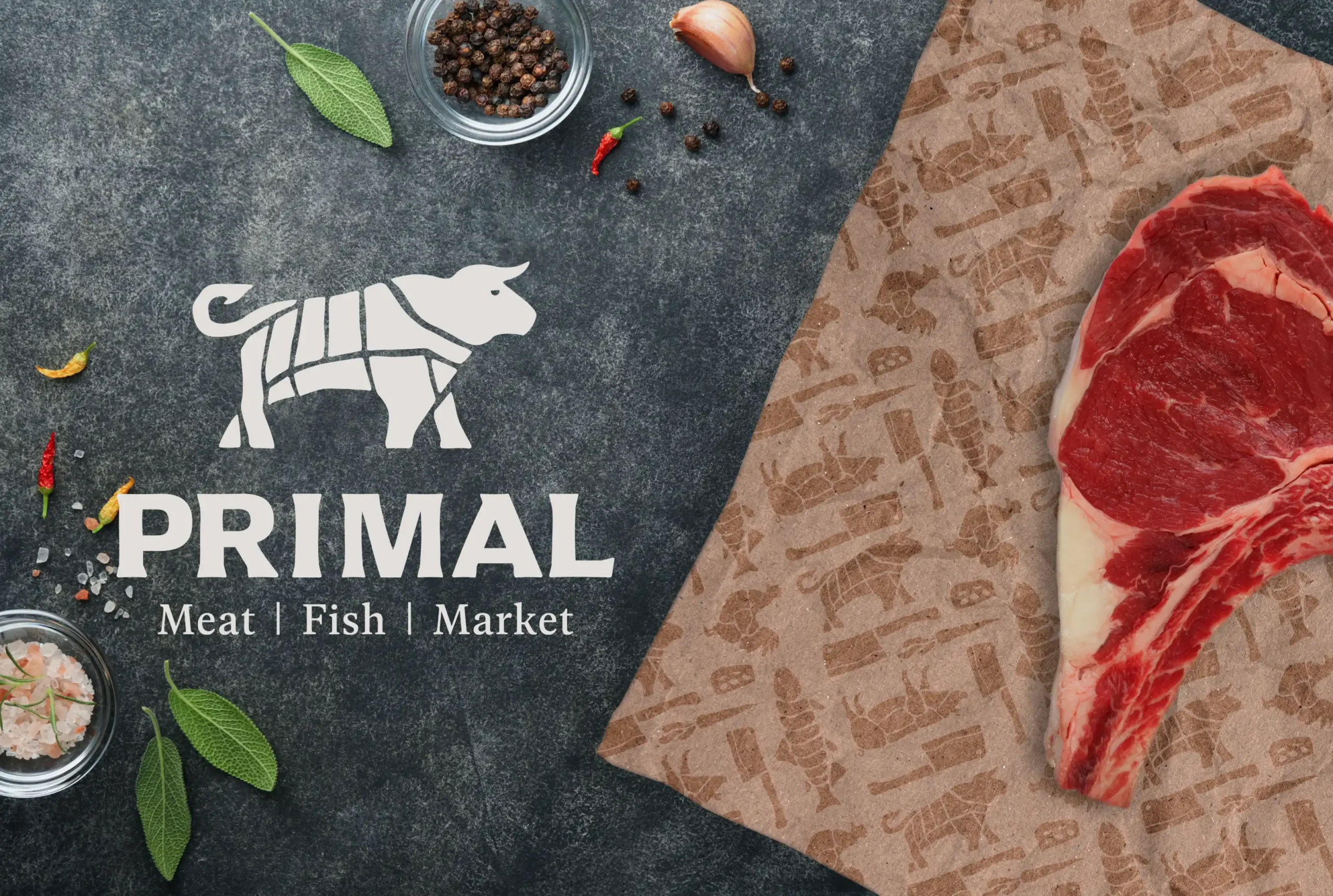


Primal was imagined as the kind of shop where a perfectly marbled steak and a scratch-made mac and cheese live comfortably next to each other. Founded by people with deep culinary roots, the market mixes the ease of a local grocery with the quality of a chef’s pantry.
A&E Design worked with the founders to develop a brand that works everywhere from the deli case to the dinner table. The identity is structured around a confident yet unpretentious logo and a palette inspired by the practicality and warmth of the kitchen: charcoal, bone, clay, steel, and subtle accents like beet and sage – colors that look sharp on packaging and feel natural in the space. Typography is utilitarian and clean, designed for shelf talkers, meal packaging, and printed menus that customers can read at a glance.
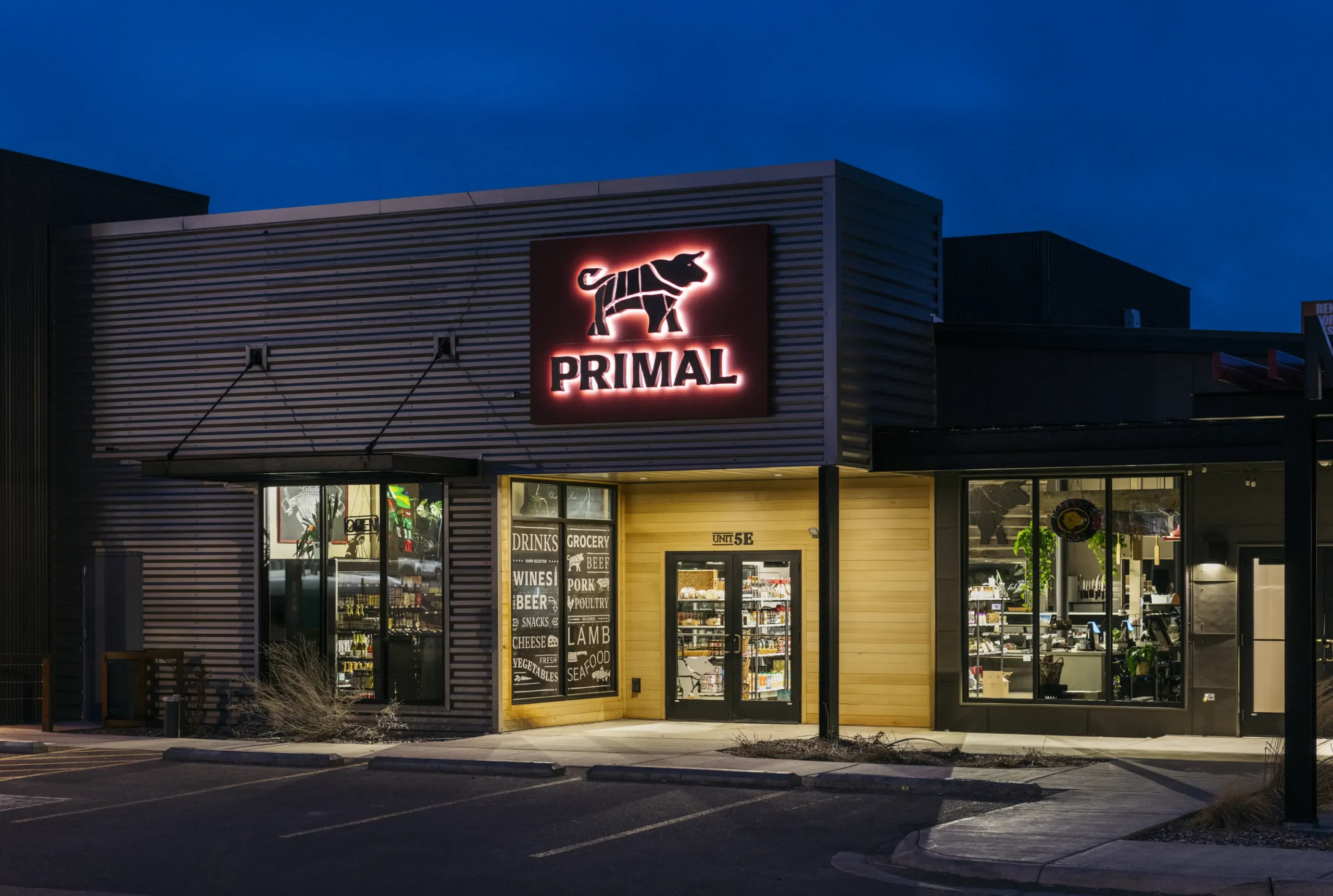
In the built space, that identity carries through without missing a beat. Materials and finishes were chosen for texture and clarity, while warm lighting and an intuitive layout guide customers naturally from the storefront to the shelves, making it easy to just find what you need – and discover something new along the way. Together, the brand elements are structured to scale and translate naturally across every touchpoint, from in-store displays to future marketing and packaging applications.
Today, with a strong brand foundation and a space to match, Primal is doing exactly what it set out to do – feeding the neighborhood with a trusted presence and creative flair, at the intersection of great food and real life. Whether customers are after the perfect seasoning, a steak to build dinner around, or the whole meal ready to go, the Primal brand delivers. Familiar, flavorful, and full of inspiration, it turns dinner into something to look forward to.