One 11
Bozeman,
Montana


HC Design sought to establish a strong market presence, and it knew it needed to refresh its brand visuals and clarify its message to achieve this goal.
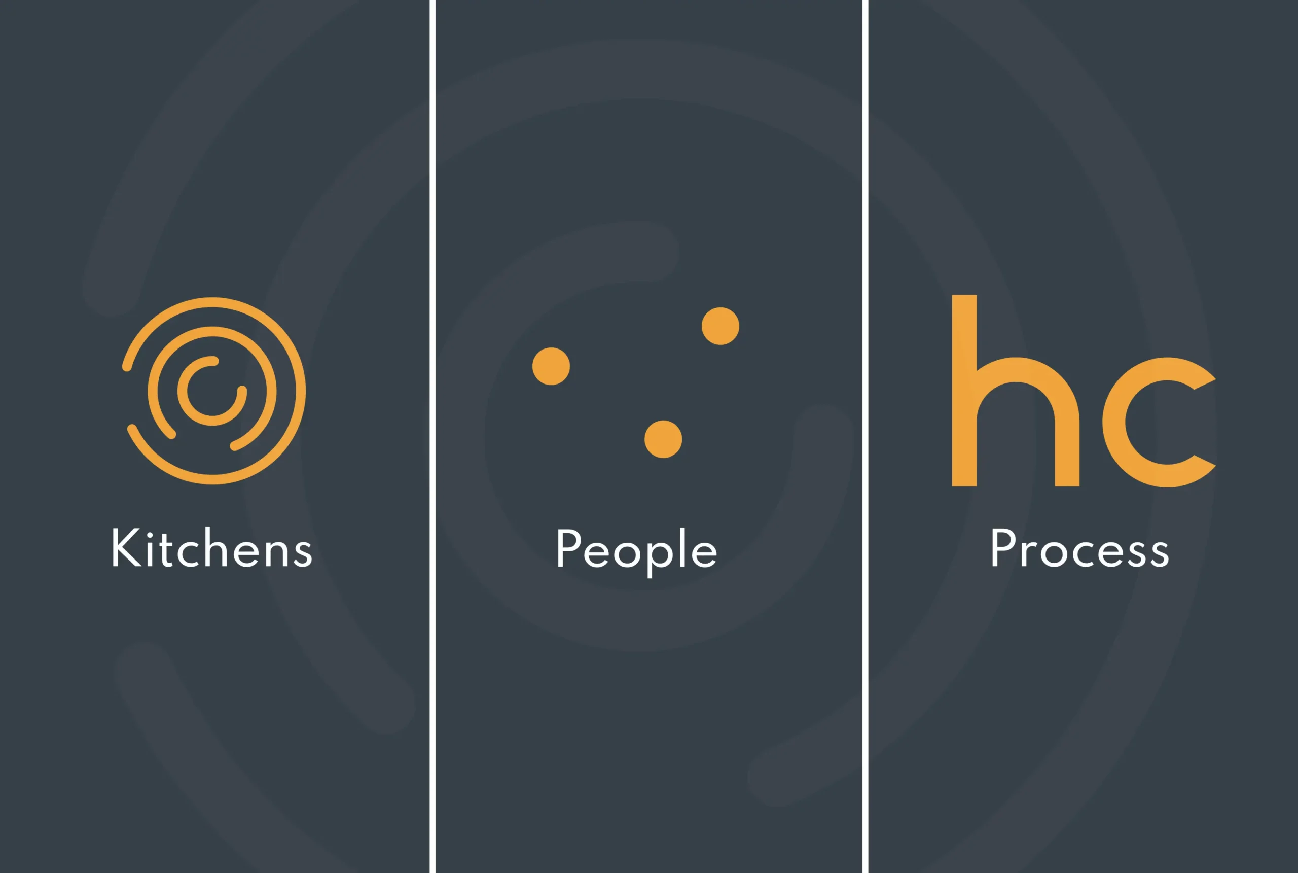
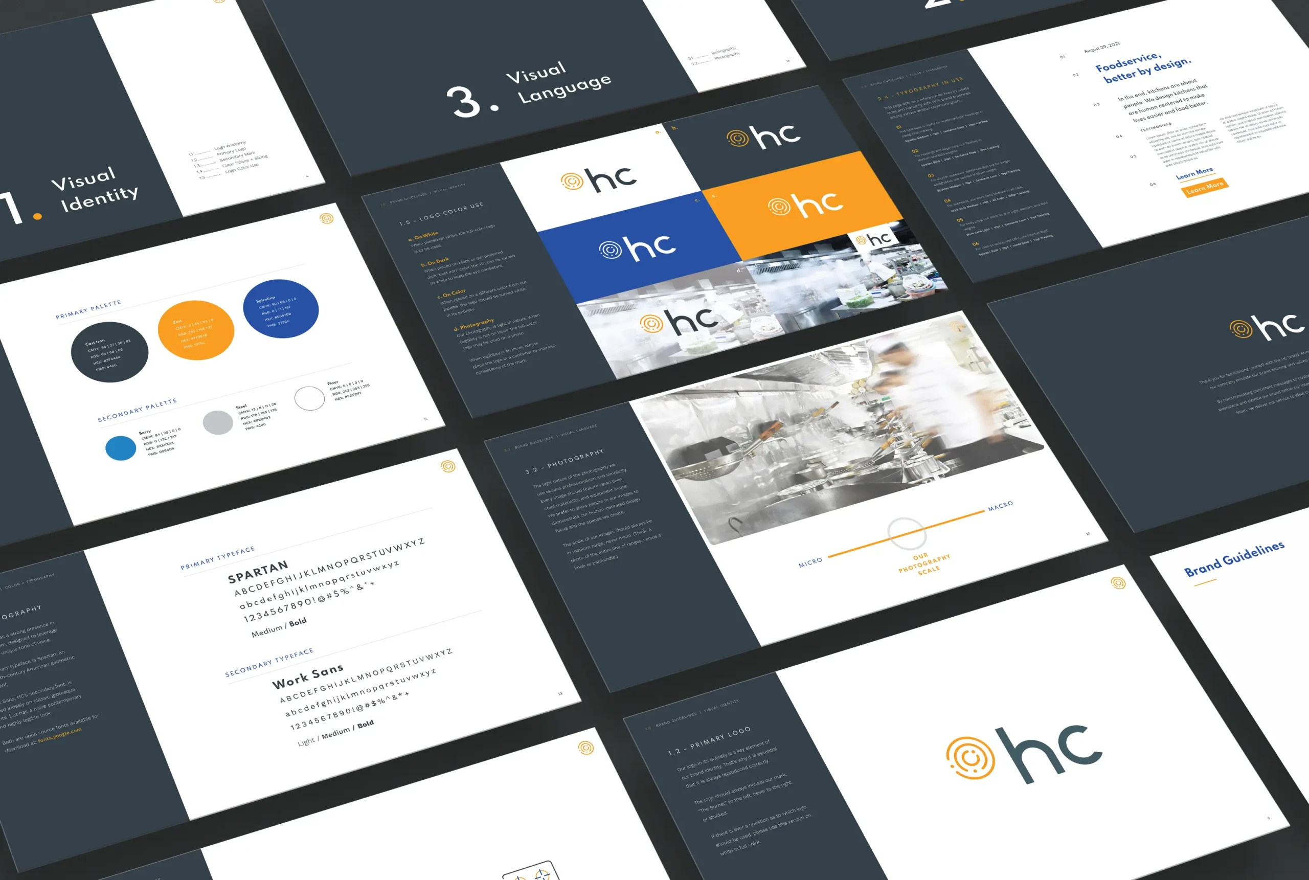
A&E Design redefined the brand’s direction, voice, and tone, and created striking new brand visuals that emphasize the brand’s core attributes. This bold, clean visual identity for HC Design features a logo inspired by a coiled stove burner. In addition to its clear visual reference, this logo symbolizes the energy and creativity inherent in their projects. The brand’s strong, active palette of orange, charcoal, and white evokes the raw materials familiar to culinary enthusiasts. Conscientious photography direction combines clean and vibrant tones with motion to showcase the familiar chaos of a kitchen setting with HC Design’s ability to create efficiency and order.
From the foundation of a definitive brand, A&E Design helped support HC Design with a series of collateral pieces, including a new website, tradeshow booth, and other marketing materials to help them tell their story.